AALE.exe
Home / Nerf UI
RESEARCH BRANDING UI DE JUEGO

Nerf UI

ROL
Investigación UX y diseño de interfaz
FORMATO
Case study de research
ENFOQUE
Traducir una marca a un HUD de shooter
MARCA
Nerf

El desafío fue diseñar la interfaz de un shooter en primera persona inspirado en la marca Nerf, con foco en visuales vibrantes y elementos de diseño lúdicos que se mantuvieran fieles a la identidad de la marca.

Empecé analizando la identidad visual de Nerf, estudié cómo shooters de referencia resuelven cada componente del HUD, diseñé mis propios componentes adaptando esos elementos a la estética de la marca, y finalmente los integré en una pantalla de juego completa.

El resultado es un HUD completo — barra de vida, contador de munición, inventario, minimapa y objetivos de misión — que traduce el tono enérgico y juguetón de Nerf a un lenguaje de interfaz de shooter reconocible.

EL DESAFÍO

Este proyecto fue una exploración del diseño de la interfaz de un shooter inspirado en la marca Nerf. El foco estuvo puesto en visuales vibrantes y elementos de diseño lúdicos, manteniéndose fiel a la identidad de la marca.

MI PROCESO
01
Entender la identidad visual
Empecé analizando el estilo visual de la marca, observando sus colores vibrantes, formas dinámicas y el tono juvenil y enérgico que la define. Esto me permitió establecer una base sólida y coherente para la identidad visual del proyecto.
02
Definir los requisitos de UI
Después, estudié los componentes esenciales de los juegos de disparos, como barras de vida, minimapas, inventarios y contadores de munición, para entender cómo estos elementos contribuyen a la experiencia e interacción del jugador con el juego.
03
Diseñar los componentes
A partir de ese análisis, diseñé mis propios componentes, adaptando elementos clave del género y fusionándolos con la estética del proyecto. Busqué crear interfaces funcionales, pero también visualmente atractivas y coherentes con el estilo general del juego.
04
El diseño final
Finalmente, organicé y ensamblé estos componentes dentro de la interfaz, prestando especial atención a la usabilidad. Me aseguré de no sobrecargar la pantalla, buscando un equilibrio entre una experiencia visualmente atractiva y una navegación fluida y accesible para el jugador.
ENTENDIENDO LA IDENTIDAD VISUAL

Antes de diseñar un solo componente, analicé el kit visual de Nerf en profundidad: sus colores, su tono, sus formas recurrentes y cómo se sintieron sus juegos anteriores.

Tipografía y colores
Los colores principales, naranja y azul, son complementarios y evocan energía y dinamismo. Las tipografías elegidas son gruesas para enfatizar los mensajes y aportar solidez, reflejando la personalidad activa y vibrante de la marca.
Tono y público
El tono de la marca Nerf se caracteriza por el dinamismo, la acción, el peligro y la diversión. Está dirigida principalmente a adolescentes y niños, lo que me permitió crear una interfaz vibrante y enérgica que refleja esa sensación de juego y adrenalina.
Hexágonos como elemento distintivo
Noté que las formas hexagonales son recurrentes en muchos productos Nerf, dándoles un aire distintivo y tecnológico. Incorporé este detalle en la interfaz para reforzar la identidad de marca y sumar una sensación moderna y tecnológica.
Análisis de las líneas de producto
Analicé las distintas líneas de producto de Nerf, cada una con su propio estilo y paleta de colores. Elegí la línea Nerf Elite, ya que su diseño se alineaba mejor con la identidad original de la marca, ofreciendo una estética dinámica y reconocible.
Los dardos como elemento clave
Identifiqué que los dardos personalizados son un símbolo icónico de Nerf, así que decidí integrarlos en la interfaz para reforzar la identidad de marca y darle un sello único al diseño.
Otros juegos de Nerf
Revisé juegos anteriores de Nerf y sus interfaces, y descubrí que existen pocos títulos y ninguno se destaca por su diseño. El más reciente ni siquiera tiene una interfaz visible durante el juego, lo que me inspiró a crear algo más inmersivo y representativo de la marca.
DEFINIENDO LOS REQUISITOS DE UI

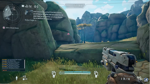
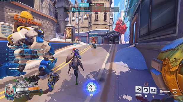
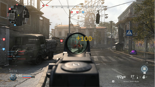
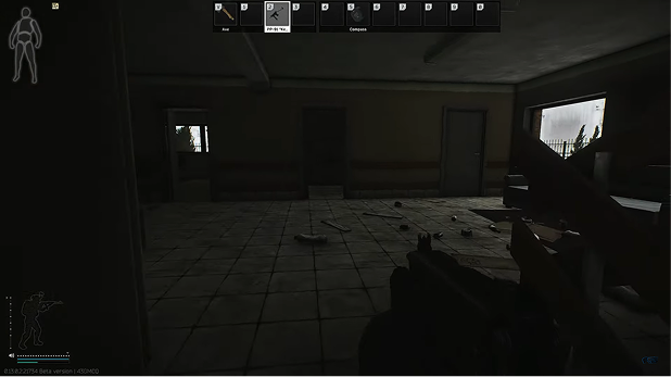
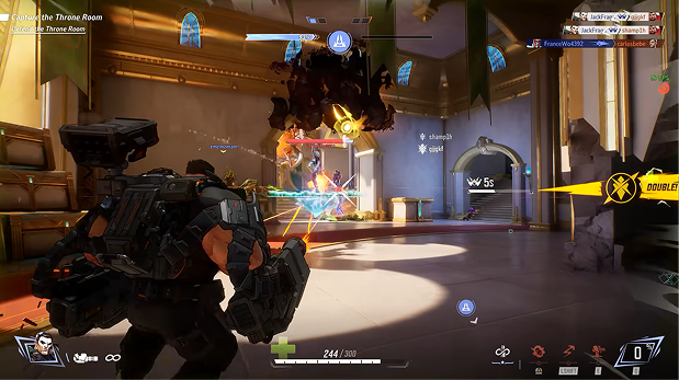
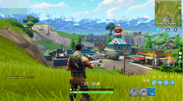
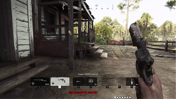
Analicé las interfaces de varios juegos de referencia — Fortnite, Hunt: Showdown, The Cycle: Frontier, Overwatch, Call of Duty, Escape from Tarkov y Marvel Rivals, entre otros — para identificar buenas prácticas de navegación, organización del HUD y accesibilidad.
01 / 07
Habilidades especiales
Las habilidades especiales suelen representarse con íconos claros y visibles. Muchas veces incluyen un temporizador de recarga y una tecla asignada, permitiendo que los jugadores las identifiquen rápidamente sin interrumpir el juego.
1 / 7
02 / 07
Ítems de inventario
Los ítems se muestran con íconos distintivos en una grilla o lista. Las descripciones emergentes al pasar el mouse aportan más detalle, manteniendo la interfaz ordenada y fácil de usar.
2 / 7
03 / 07
Contador de munición
El contador de balas está ubicado de forma prominente, generalmente con colores contrastantes y tipografía legible, permitiendo que los jugadores vean rápidamente el estado de su munición.
3 / 7
04 / 07
Minimapa
El minimapa es compacto y dinámico, con íconos que indican la posición del jugador y otros puntos de interés. Su diseño busca ser informativo sin resultar intrusivo, facilitando la navegación.
4 / 7
05 / 07
Objetivos
Los objetivos se muestran con claridad, generalmente con un ícono y texto, para que el jugador siempre sepa qué hacer a continuación sin sobrecargar la pantalla.
5 / 7
06 / 07
Chat
El chat se presenta en una ventana o barra discreta. Es funcional, permitiendo la comunicación sin saturar la interfaz, con opciones de personalización que mejoran la experiencia social.
6 / 7
07 / 07
Barra de vida
La barra de vida es una de las interfaces más visibles, usando colores y efectos para indicar la salud restante, permitiendo que el jugador tome decisiones rápidas según su estado.
7 / 7
FORTNITE
HUNT: SHOWDOWN
THE CYCLE: FRONTIER
OVERWATCH
CALL OF DUTY
ESCAPE FROM TARKOV
MARVEL RIVALS
FORTNITE
Fortnite
HUNT: SHOWDOWN
Hunt: Showdown
THE CYCLE: FRONTIER
The Cycle: Frontier
OVERWATCH
Overwatch
CALL OF DUTY
Call of Duty
ESCAPE FROM TARKOV
Escape from Tarkov
MARVEL RIVALS
Marvel Rivals
DISEÑANDO LOS COMPONENTES

Exploré y desarrollé los componentes clave que darían forma a la interfaz, guiado por las necesidades del usuario, el diseño centrado en las personas y la consistencia visual del sistema.
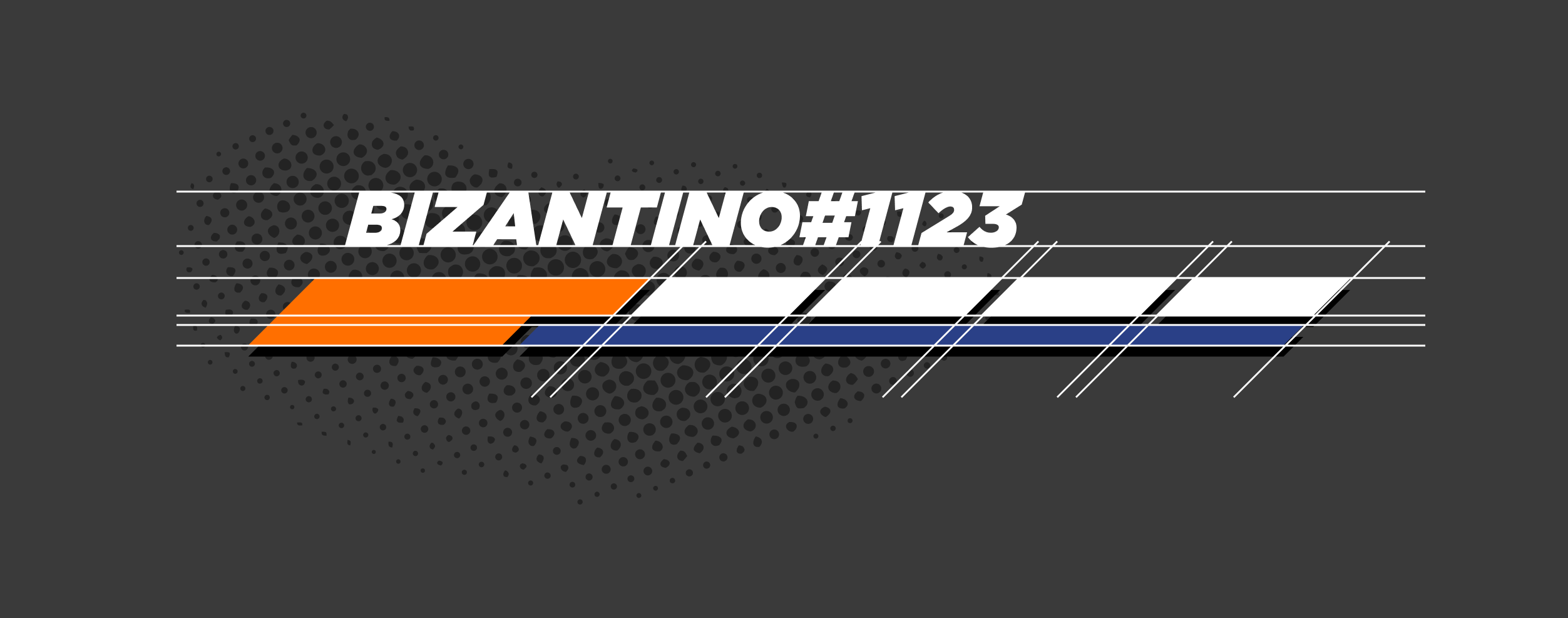
Barra de vida
Ubiqué el nombre del personaje seleccionado arriba, facilitando identificar la cuenta elegida.
A
Ubiqué el nombre del personaje arriba para facilitar su identificación, mejorando tanto la personalización como la visibilidad en la interfaz.
B
Agregué una barra secundaria dentro de la barra de vida para mostrar el nivel de protección del jugador, dando un estado más claro sin sobrecargar la interfaz.
C
Una sección de la barra de vida es más grande, pensada para resaltar la salud crítica, asegurando que el jugador note rápidamente cuando está en peligro.
D
Dividí la barra de vida en secciones para que el jugador pueda evaluar rápidamente su salud, especialmente en un gameplay de ritmo acelerado.
E
Para mejorar la visibilidad, agregué un fondo negro a la barra de vida, asegurando que resalte en zonas donde su color blanco podría mezclarse con el gameplay.
Barra de vida — anotada
A
B
C
D
E
A
Ubiqué el nombre del personaje arriba para facilitar su identificación, mejorando tanto la personalización como la visibilidad en la interfaz.
B
Agregué una barra secundaria dentro de la barra de vida para mostrar el nivel de protección del jugador, dando un estado más claro sin sobrecargar la interfaz.
C
Una sección de la barra de vida es más grande, pensada para resaltar la salud crítica, asegurando que el jugador note rápidamente cuando está en peligro.
D
Dividí la barra de vida en secciones para que el jugador pueda evaluar rápidamente su salud, especialmente en un gameplay de ritmo acelerado.
E
Para mejorar la visibilidad, agregué un fondo negro a la barra de vida, asegurando que resalte en zonas donde su color blanco podría mezclarse con el gameplay.
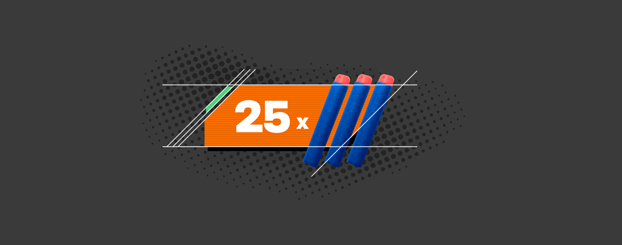
Contador de munición
Sumé la tecla asignada y una foto realista del producto Nerf sobre fondo naranja, siguiendo el kit visual.
A
Agregué una barra de color para indicar la rareza del arma, creando una distinción visual que mejora la percepción del jugador sobre el valor del arma.
B
El número principal representa la cantidad de munición, ubicado de forma prominente para un acceso rápido, asegurando que los jugadores puedan seguir fácilmente sus disparos restantes.
C
Usé imágenes de dardos para representar la munición, ya que son icónicos de la marca y se alinean bien con la identidad visual, sumando tanto funcionalidad como branding.
D
Se agregó un fondo naranja vibrante para mantener la consistencia con la identidad visual, aportando atractivo estético y asegurando que el elemento se destaque.
Contador de munición — anotado
A
B
C
D
A
Agregué una barra de color para indicar la rareza del arma, creando una distinción visual que mejora la percepción del jugador sobre el valor del arma.
B
El número principal representa la cantidad de munición, ubicado de forma prominente para un acceso rápido, asegurando que los jugadores puedan seguir fácilmente sus disparos restantes.
C
Usé imágenes de dardos para representar la munición, ya que son icónicos de la marca y se alinean bien con la identidad visual, sumando tanto funcionalidad como branding.
D
Se agregó un fondo naranja vibrante para mantener la consistencia con la identidad visual, aportando atractivo estético y asegurando que el elemento se destaque.
Ítems de inventario
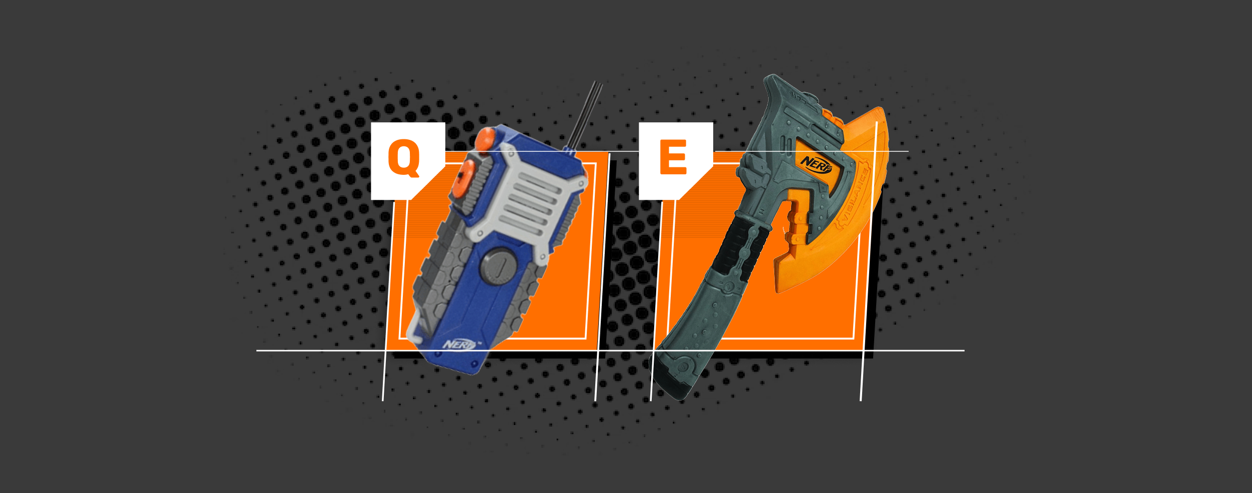
Cada ítem con un ícono distintivo en una grilla clara y fácil de escanear.
A
Agregué la tecla asignada a cada ítem como un elemento clave, asegurando que los jugadores puedan identificar rápidamente cómo usarlo durante el juego.
B
El elemento visual principal es una foto realista del producto Nerf, creando una conexión directa con la marca y mejorando el reconocimiento del ítem por parte del jugador.
C
Encerré el ítem en un fondo naranja para que se destaque, siguiendo la identidad visual y asegurando que capte la atención del jugador.
Ítems de inventario — anotado
A
B
C
A
Agregué la tecla asignada a cada ítem como un elemento clave, asegurando que los jugadores puedan identificar rápidamente cómo usarlo durante el juego.
B
El elemento visual principal es una foto realista del producto Nerf, creando una conexión directa con la marca y mejorando el reconocimiento del ítem por parte del jugador.
C
Encerré el ítem en un fondo naranja para que se destaque, siguiendo la identidad visual y asegurando que capte la atención del jugador.
Minimapa
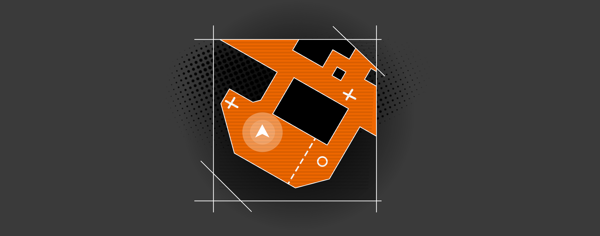
Encerrado en un cuadrado con esquinas en 45°, con la posición del jugador y puntos de interés bien claros.
A
Encerré el minimapa en un cuadrado grande con dos esquinas en 45°, alineándolo con el diseño general y asegurando consistencia visual.
B
La posición del jugador se indica claramente en el mapa, permitiendo una orientación rápida y mejorando la navegación durante el juego.
C
Agregué elementos como obstáculos y puntos de interés en el mapa, aportando contexto valioso para mejorar la toma de decisiones del jugador.
Minimapa — anotado
A
B
C
A
Encerré el minimapa en un cuadrado grande con dos esquinas en 45°, alineándolo con el diseño general y asegurando consistencia visual.
B
La posición del jugador se indica claramente en el mapa, permitiendo una orientación rápida y mejorando la navegación durante el juego.
C
Agregué elementos como obstáculos y puntos de interés en el mapa, aportando contexto valioso para mejorar la toma de decisiones del jugador.
Detalles de misión
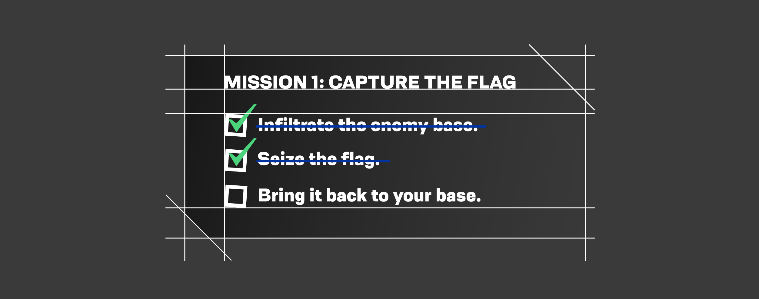
Título de misión y objetivos con checks, para que el jugador siempre sepa qué sigue sin perder inmersión.
A
Encerré los detalles de la misión en una card con colores sutiles para no sobrecargar la pantalla, ya que contiene información secundaria.
B
El número y el título de la misión se muestran de forma prominente, asegurando que el jugador identifique fácilmente la tarea en cuestión.
D
Incluí las sub-misiones con checks para indicar su cumplimiento, ofreciendo una forma clara y organizada de seguir el progreso.
E
Las sub-misiones completadas se marcan con texto tachado, aportando una señal visual de que el objetivo fue finalizado.
Detalles de misión — anotado
A
B
D
E
A
Encerré los detalles de la misión en una card con colores sutiles para no sobrecargar la pantalla, ya que contiene información secundaria.
B
El número y el título de la misión se muestran de forma prominente, asegurando que el jugador identifique fácilmente la tarea en cuestión.
D
Incluí las sub-misiones con checks para indicar su cumplimiento, ofreciendo una forma clara y organizada de seguir el progreso.
E
Las sub-misiones completadas se marcan con texto tachado, aportando una señal visual de que el objetivo fue finalizado.
EL DISEÑO FINAL

Después de desarrollar y analizar los componentes clave, los integré en el diseño final de gameplay. Cada elemento se ubicó con cuidado para mantener coherencia visual y una experiencia fluida y funcional.

EN EL JUEGO
SOLO LA INTERFAZ
LO QUE ME LLEVO

«Traducir una marca a una interfaz es traducir sus reglas visuales, no solo sus colores.»

Analizar hexágonos, tipografías y dardos antes de tocar un solo componente del HUD me enseñó que la identidad de marca se construye con reglas repetibles — y esas reglas son las que después se convierten en decisiones de UI concretas.

¿Armamos algo juntos?
Press start.

Busco sumarme a equipos y proyectos de la industria de juegos. Si mi perfil te cierra, hablemos.

© 2026 Agustín Ale · Buenos Aires, Argentina · GG<3
AALE.exe
Home / Nerf UI
RESEARCH BRANDING GAME UI

Nerf UI

ROLE
UX research & interface design
FORMAT
UX research case study
FOCUS
Translating a brand into a shooter HUD
BRAND
Nerf

The challenge was to design the interface of a first-person shooter inspired by the Nerf brand, focusing on vibrant visuals and playful design elements that stayed true to the brand's identity.

I started by analyzing Nerf's visual identity, studied how reference shooters solve each HUD component, designed my own components adapting those elements to the brand's aesthetic, and finally integrated them into a full gameplay screen.

The result is a complete HUD — life bar, ammo counter, inventory, minimap and mission objectives — that translates Nerf's energetic, playful tone into a recognizable shooter interface language.

THE CHALLENGE

This project was an exploration of designing a shooter game's interface inspired by the Nerf brand. The focus was on vibrant visuals and playful design elements, staying true to the brand's identity.

MY WAY
01
Understanding the visual key
I began by analyzing the brand's visual style, observing its vibrant colors, dynamic shapes and the youthful and energetic tone that defines it. This allowed me to establish a solid and coherent foundation for the project's visual identity.
02
Defining UI requirements
Next, I studied the essential components of shooter games, such as life bars, minimaps, inventories and ammo counters, in order to understand how these elements contribute to the player's experience and interaction with the game.
03
Designing the components
Based on that analysis, I designed my own components, adapting key elements of the genre and merging them with the aesthetics of the project. I sought to create interfaces that were functional, but also visually appealing and coherent with the overall style of the game.
04
The final design
Finally, I organized and assembled these components within the interface, paying special attention to usability. I made sure not to overload the screen, looking for a balance between a visually appealing experience and a fluid and accessible navigation for the player.
UNDERSTANDING THE VISUAL KEY

Before designing a single component, I analyzed Nerf's visual kit in depth: its colors, its tone, its recurring shapes, and how its previous games felt.

Typography and colors
The main colors, orange and blue, are complementary and evoke energy and dynamism. The typefaces chosen are heavy to emphasize the messages and provide solidity, reflecting the active and vibrant personality of the brand.
Tone and target audience
The tone of the Nerf brand is characterized by dynamism, action, danger and fun. It is aimed primarily at teenagers and children, which allowed me to create a vibrant and energetic interface that reflects that sense of play and adrenaline.
Hexagons as a distinctive element
I noticed that hexagonal shapes are prevalent in many Nerf products, giving them a distinctive, technological feel. I incorporated this detail into the interface to reinforce the brand identity and add a modern, technological feel.
Analysis of product lines
I analyzed the different Nerf product lines, each with its own style and color palette. I chose the Nerf Elite line, as its design aligned more closely with the brand's original identity, offering a dynamic and recognizable aesthetic.
Darts as a key element
I identified that custom darts are an iconic symbol of Nerf, so I decided to integrate them into the interface to reinforce the brand identity and make the design unique.
Other Nerf games
I reviewed previous Nerf games and their interfaces, discovering that few titles exist and none stand out for their design. The most recent one even lacks a visible interface during gameplay, which inspired me to create something more immersive and representative of the brand.
DEFINING UI REQUIREMENTS

I analyzed the interfaces of several reference games — Fortnite, Hunt: Showdown, The Cycle: Frontier, Overwatch, Call of Duty, Escape from Tarkov and Marvel Rivals, among others — to identify best practices in navigation, HUD organization and accessibility.

01 / 07
Special abilities
Special abilities are usually represented by clear and visible icons. They often include a recharge timer and an assigned key, allowing players to quickly identify them without interrupting gameplay.
1 / 7
02 / 07
Inventory items
Items are displayed with distinctive icons in a grid or list. Pop-up descriptions on hover provide more detail, keeping the interface tidy and easy to use.
2 / 7
03 / 07
Ammo Count
The bullet counter is prominently placed, usually with contrasting colors and legible typography, allowing players to quickly see the status of their ammunition.
3 / 7
04 / 07
Minimap
The minimap is compact and dynamic, with icons indicating the player's position and other points of interest. Its design aims to be informative but not intrusive, facilitating navigation.
4 / 7
05 / 07
Objectives
Objectives are clearly displayed, usually with an icon and text, so that the player always knows what to do next without overloading the screen.
5 / 7
06 / 07
Chat
Chat is presented in an unobtrusive window or bar. It is functional, allowing communication without cluttering the interface, with customization options to enhance the social experience.
6 / 7
07 / 07
Life Bar
The life bar is one of the most visible interfaces, using colors and effects to indicate remaining health, ensuring the player can quickly make decisions based on their status.
7 / 7
FORTNITE
HUNT: SHOWDOWN
THE CYCLE: FRONTIER
OVERWATCH
CALL OF DUTY
ESCAPE FROM TARKOV
MARVEL RIVALS
FORTNITE
Fortnite
HUNT: SHOWDOWN
Hunt: Showdown
THE CYCLE: FRONTIER
The Cycle: Frontier
OVERWATCH
Overwatch
CALL OF DUTY
Call of Duty
ESCAPE FROM TARKOV
Escape from Tarkov
MARVEL RIVALS
Marvel Rivals
DESIGNING THE COMPONENTS

I explored and developed the key components that would shape the interface, guided by user needs, human-centered design principles, and the system's visual consistency.

Life bar
I placed the selected character's name at the top, making it easy to identify the chosen account.
A
I placed the character's name at the top to make identification easier, enhancing both personalization and visibility in the interface.
B
I added a secondary bar within the health bar to display the player's protection level, providing a clearer status without overloading the interface.
C
One section of the health bar is larger, designed to highlight critical health, ensuring the player can quickly notice when they're in danger.
D
I divided the health bar into sections to allow the player to quickly gauge their health, especially in the fast-paced gameplay.
E
To improve visibility, I added a black background to the health bar, ensuring it stands out in areas where its white color might blend in with the gameplay.
Life bar — annotated
A
B
C
D
E
A
I placed the character's name at the top to make identification easier, enhancing both personalization and visibility in the interface.
B
I added a secondary bar within the health bar to display the player's protection level, providing a clearer status without overloading the interface.
C
One section of the health bar is larger, designed to highlight critical health, ensuring the player can quickly notice when they're in danger.
D
I divided the health bar into sections to allow the player to quickly gauge their health, especially in the fast-paced gameplay.
E
To improve visibility, I added a black background to the health bar, ensuring it stands out in areas where its white color might blend in with the gameplay.
Ammo counter
Added the assigned keybind plus a realistic photo of the Nerf item on an orange background, following the visual key.
A
I added a color bar to indicate the weapon's rarity, creating a visual distinction that enhances the player's awareness of the weapon's value.
B
The main number represents the ammo count, placed prominently for quick access, ensuring players can easily track their remaining shots.
C
I used dart images to represent the ammo, as they are iconic to the brand and align well with the visual key, adding both functionality and branding.
D
A vibrant orange background was added to maintain consistency with the visual key, providing an aesthetic appeal while ensuring the element stands out.
Ammo counter — annotated
A
B
C
D
A
I added a color bar to indicate the weapon's rarity, creating a visual distinction that enhances the player's awareness of the weapon's value.
B
The main number represents the ammo count, placed prominently for quick access, ensuring players can easily track their remaining shots.
C
I used dart images to represent the ammo, as they are iconic to the brand and align well with the visual key, adding both functionality and branding.
D
A vibrant orange background was added to maintain consistency with the visual key, providing an aesthetic appeal while ensuring the element stands out.
Inventory items
Each item shown with a distinctive icon in a clear, easy-to-scan grid.
A
I added the keybind for each item as a key element, ensuring players can quickly identify how to use the item during gameplay.
B
The main visual element is a realistic photo of the Nerf item, creating a direct connection to the brand and enhancing the player's recognition of the item.
C
I enclosed the item in an orange background to make it stand out, following the visual key and ensuring it grabs the player's attention.
Inventory items — annotated
A
B
C
A
I added the keybind for each item as a key element, ensuring players can quickly identify how to use the item during gameplay.
B
The main visual element is a realistic photo of the Nerf item, creating a direct connection to the brand and enhancing the player's recognition of the item.
C
I enclosed the item in an orange background to make it stand out, following the visual key and ensuring it grabs the player's attention.
Minimap
Encased in a square with 45° angled corners, with the player's position and points of interest clearly marked.
A
I encased the minimap in a large square with two 45° angled corners, aligning it with the overall design and ensuring visual consistency.
B
The player's position is clearly indicated on the map, allowing for quick orientation and improving navigation during gameplay.
C
I added elements like obstacles and points of interest on the map, providing valuable context to enhance the player's decision-making.
Minimap — annotated
A
B
C
A
I encased the minimap in a large square with two 45° angled corners, aligning it with the overall design and ensuring visual consistency.
B
The player's position is clearly indicated on the map, allowing for quick orientation and improving navigation during gameplay.
C
I added elements like obstacles and points of interest on the map, providing valuable context to enhance the player's decision-making.
Mission details
Mission title and objectives with checkmarks, so the player always knows what's next without losing immersion.
A
I enclosed the mission details in a card with subtle colors to avoid overwhelming the screen, as it contains secondary information.
B
The mission number and title are prominently displayed, ensuring the player can easily identify the task at hand.
D
I included the sub-missions with checkmarks to indicate completion, offering a clear and organized way to track progress.
E
Completed sub-missions are marked with strikethrough text, providing a visual cue that the objective has been finished.
Mission details — annotated
A
B
D
E
A
I enclosed the mission details in a card with subtle colors to avoid overwhelming the screen, as it contains secondary information.
B
The mission number and title are prominently displayed, ensuring the player can easily identify the task at hand.
D
I included the sub-missions with checkmarks to indicate completion, offering a clear and organized way to track progress.
E
Completed sub-missions are marked with strikethrough text, providing a visual cue that the objective has been finished.
THE FINAL DESIGN

After developing and analyzing the key components, I integrated them into the final gameplay design. Each element was carefully placed to keep visual coherence and a fluid, functional experience.

IN-GAME
INTERFACE ONLY
WHAT I TAKE AWAY FROM IT

"Translating a brand into an interface means translating its visual rules, not just its colors."

Analyzing hexagons, typography and darts before touching a single HUD component taught me that brand identity is built from repeatable rules — and those rules are what later become concrete UI decisions.